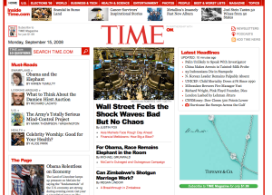
Site Redesign for TIME.com
This morning started like most mornings. I was jerked into a form of irritated wakefullness by the insanely loud beep on my cell phone. I laid in bed for a couple of minutes savoring the last moments of warmth and quiet. Finally I sat down in front of my computer, clicked the little Firefox icon and waited a moment for my homepage to pop up. My homepage has been Time.com for about a year. I’ve checked out all the other major news sources for something that I could bear to look at every morning. CNN is pretty good, New York Times is pretty bland and too newspaperish, BBC was at the time I checked also somewhat boring. So, I settled on TIME. I liked their slideshow of headlines, I liked reading “The Page” by Mark Halperin.
But today, everything changed.
At first, I thought maybe my browser was just messing up. Every once in awhile the CSS won’t load properly and the page will look all screwed up. I reloaded. No Change. One more time… nothing. I even quit my browser, and tried another.
But, it was gone. The old look was banished to the past. No more headline slideshow.
Now, of course we all know that occasional redesigns are just a part of any good marketing strategy. We’re usually lost at first, confused, nostalgic for old times. Take Facebook. The first time they redesigned there was an uproar, but then the new features and qualities came through over time and its popularity grew more than ever.
However, there are no outstanding new features on the new TIME. The design doesn’t look cutting edge. There’s no new rounded corners or soft gradients that make us go “oooh.”
In fact, it looks thrown together. Like someone said, “oh, dude, by the way I designed this new look the other night for the website… forgot to mention it in today’s meeting.”
So is it just me? It is really that bad or did I just wake up on the wrong side of the bed this morning? We’ll see tomorrow… but suffice it to say, I’ve changed my homepage to BBC… which I’ve noticed is sporting a great new look since I last visited.

M. Anthony Aiello replied:
Couldn’t agree more. I too check time.com each morning; I too reloaded the page thinking CSS messed up (though I doubted it because there was so much layout apparent). Dreadful redesign. I like the reporting, though…. But I don’t know how I’ll find the articles I want to read anymore.
September 15, 2008 at 1:51 pm. Permalink.
Kathy L. Hersey replied:
Ditto. I think that Time should be embarrassed. There’s no strong hierarchy in content, there are way too many font sizes happening (oh and Arial black?? Are we back in 1999?), there’s red everywhere…. my eye doesn’t know where to go… it’s very dizzying. It’s almost a poor (emphasis on the poor) imtitation of the New York Times site except that the NY Times actually makes sense. There’s definitely no original thought here. It’s unfortunate. I wasn’t a huge fan of their old site but at least it was easy to read and navigate.
September 16, 2008 at 4:11 am. Permalink.